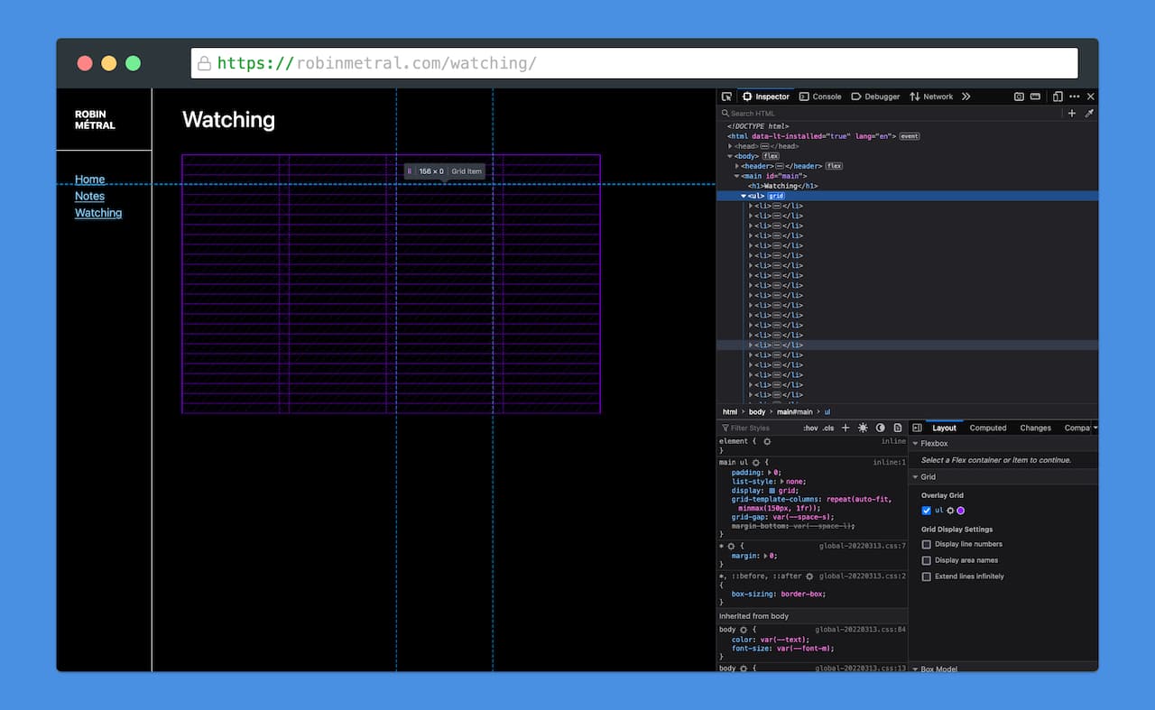
A pretty common web pattern: image grids. I wanted one for my Watching page, where I display a film posters grid.
A possible problem with this pattern is performance and data usage: although the HTML for the page is only 5 KB (0.005 MB), the (currently) 107 poster images total almost 7 MB1.

Luckily, we don't even need to reach for JavaScript to solve this: modern HTML and CSS have us covered.
A responsive image grid using CSS Grid
But first, let's start with the basics: using CSS Grid, we can build a simple, responsive image grid:
<ul>
  <!-- This is a list of films, so we're using a ul -->
  <li><img src="https://..." alt="Film name" /></li>
  <li><img src="https://..." alt="Film name" /></li>
  <li><img src="https://..." alt="Film name" /></li>
  <li><img src="https://..." alt="Film name" /></li>
</ul>

<style>
  ul {
    display: grid;
    grid-template-columns: repeat(auto-fit, minmax(150px, 1fr));
    grid-gap: 16px;
    /* List styles reset */
    padding: 0;
    list-style: none;
  }
</style>
Look mom, no media queries!

Lazy-loading images with loading="lazy"
Now that we have a basic image grid, it's time to improve performance.
In a nutshell, lazy-loading = not loading images (or CSS, or JS) that are used further down the page, below the fold.
This is typically being done using the Interaction Observer Web API (or before that, using scroll handlers). However, this approach has a few downsides:
- it requires developers to create an observer, write a callback to load an image dynamically, define intersection thresholds (to trigger the callback just before an image comes into view so it has time to load)... so developers created libraries that abstract all of this away2.
- it only works with JavaScript! Sure, users disabling JavaScript these days are rare3, but it's still good to see JS as a way to progressively enhance pages, and achieve things that aren't possible with HTML and CSS...
...and lazy-loading images isn't one of these things (anymore).
In fact, modern browsers support it out of the box on the <img /> element:
<img src="https://..." alt="Film name" loading="lazy" />
That's all we need to lazy-load an image!
Except that in our posters grid, this won't quite work yet.
Before it loads, a browser can't know an image's dimensions. So when the grid markup initially loads, the browser sees that all images fit into the viewport, and it loads them all.
We can verify this by blocking the URL4 where images are hosted and inspecting the page. The only reason that the grid has any height at all is because of the grid-gap.

So we need to explicitly set dimensions on images:
<img
  src="https://..."
  alt="Film name"
  loading="lazy"
  width="250"
  height="375"
/>
Setting an explicit width and height for images won't only enable lazy-loading, it'll also reduce layout shifts, improving user experience (and Lighthouse scores).
Using CSS aspect-ratio
The problem when setting height="375" is that image height will stretch to 375px. The width will be constrained to the grid.
That's where CSS comes in for the finishing touches:
img {
  height: auto;
  aspect-ratio: 250 / 375;
  object-fit: cover;
}
Only height: auto; is truly necessary here. aspect-ratio and object-fit deal with the issue that not all poster images have the same dimensions: we manually set the aspect-ratio to 250 by 375 and use object-fit to avoid deforming the image.
And tada!

Browser support
Granted, this is mostly a solution for 2022 onward:
loading="lazy"has just received support in Safari 15.4 last month, and has been supported in Chrome and Firefox since 2019-2020. It has 75% support globally (caniuseloading="lazy").aspect-ratioreceived support in Chrome, Firefox and Safari in 2021. It has 84% support globally (caniuseaspect-ratio).
Fortunately, as long as a browser supports CSS Grid (94% do: caniuse display: grid), the image grid will still render acceptably—the lazy-loading and use of aspect-ratio can be considered progressive enhancements.
However, if you want to save your Safari users some data, you might want to stick to Interaction Observers a while longer... or polyfill loading="lazy".
Final considerations
The solution is by no means perfect, and is simply intended as an example of what's possible with these new features.
Some additional questions to ask when considering this pattern could be:
- Should the page load so many images without pagination?
- Should images load by default or could users opt out of the behavior?
- Can the interface adapt to
prefers-reduced-data? - Can the source images be further optimized by using smaller sizes or new image formats?
Footnotes
This isn't so bad considering that the average page size according to the HTTP Archive's Page Weight report is 2 MB, but it's still a lot. ↩
Which comes with another set of downsides: heavy general-purpose libraries, need for maintenance and upgrades, security concerns, etc. ↩
Possibly because most websites won't work without it? ↩
Here's how to block specific URLs using the Firefox devtools. ↩